Branding - Icon Design - Web Design - Mobile App Design Supervision / Back-End: KAI Software
sō.capital was a new search engine aggregator focused on parsing crowdfunding campaigns to one spot.
Think of it as the Kayak or Pinterest version of crowdfunding campaigns. so.capital helps users find
campaigns that matter to them without the hassle of searching through multiple crowdfunding sites
all at once. Finding what matters to you shouldn't be so hard.
Think of it as the Kayak or Pinterest version of crowdfunding campaigns. so.capital helps users find
campaigns that matter to them without the hassle of searching through multiple crowdfunding sites
all at once. Finding what matters to you shouldn't be so hard.
THE PROBLEM + OBSERVATIONS
There are 1K+ crowdfunding platforms that exist as of 2021, which can make finding a crowdfunding campaign to invest or donate towards very hard. In addition to the mass amount of platforms, there are also different types of crowdfunding platforms that focus on specialized categories like non-profit, gaming, independent, start-ups and personal campaigns. Filtering through these campaigns and searching on multiple platforms can be stressful and tedious. What if we brought all of those campaigns to one place?
But first, branding.
Bright, colorful and friendly. We wanted the look and feel to be attractive to various users - from top investors to those who just want to find campaigns to donate.
Bright, colorful and friendly. We wanted the look and feel to be attractive to various users - from top investors to those who just want to find campaigns to donate.
Avoiding coming off as pretentious or elitist. Investing in campaigns can and should be for everyone!
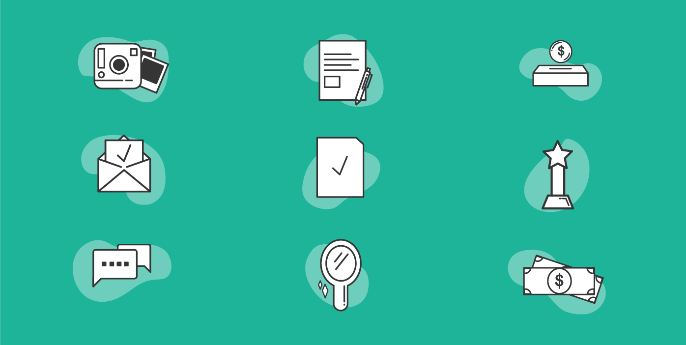
icons
final logo

illustration
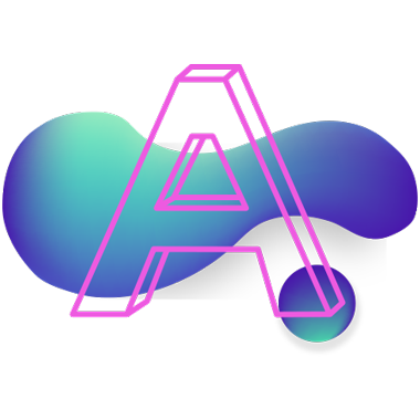
Prototype (MVP)
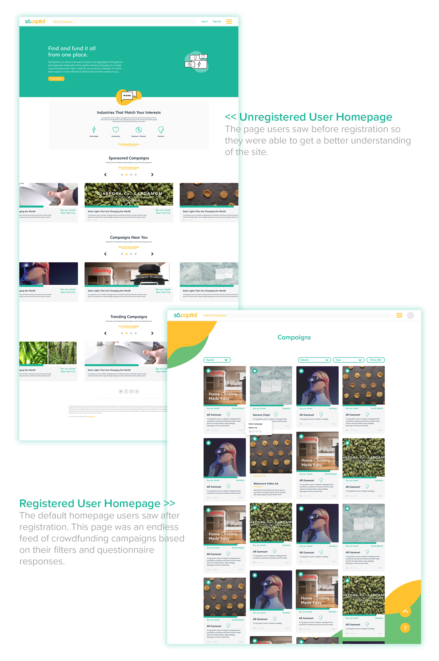
Homepage
Designed to be easy to navigate and filter. The registered user’s homepage was built in a similar fashion to Pinterest with detailed cards so users could decide which campaigns to view. One main goal of the website was to gain registered users. Unregistered users were only able to view a few campaigns on the site until prompted to register on the site.
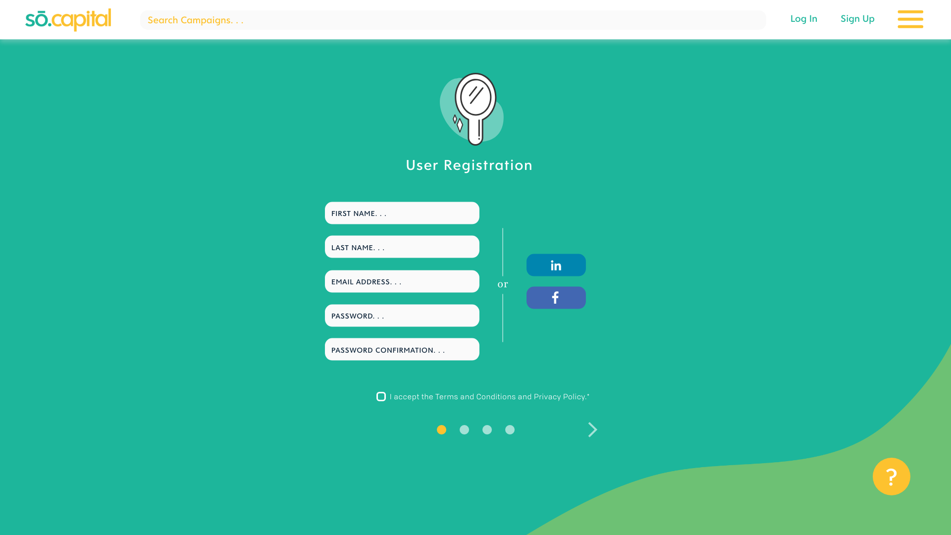
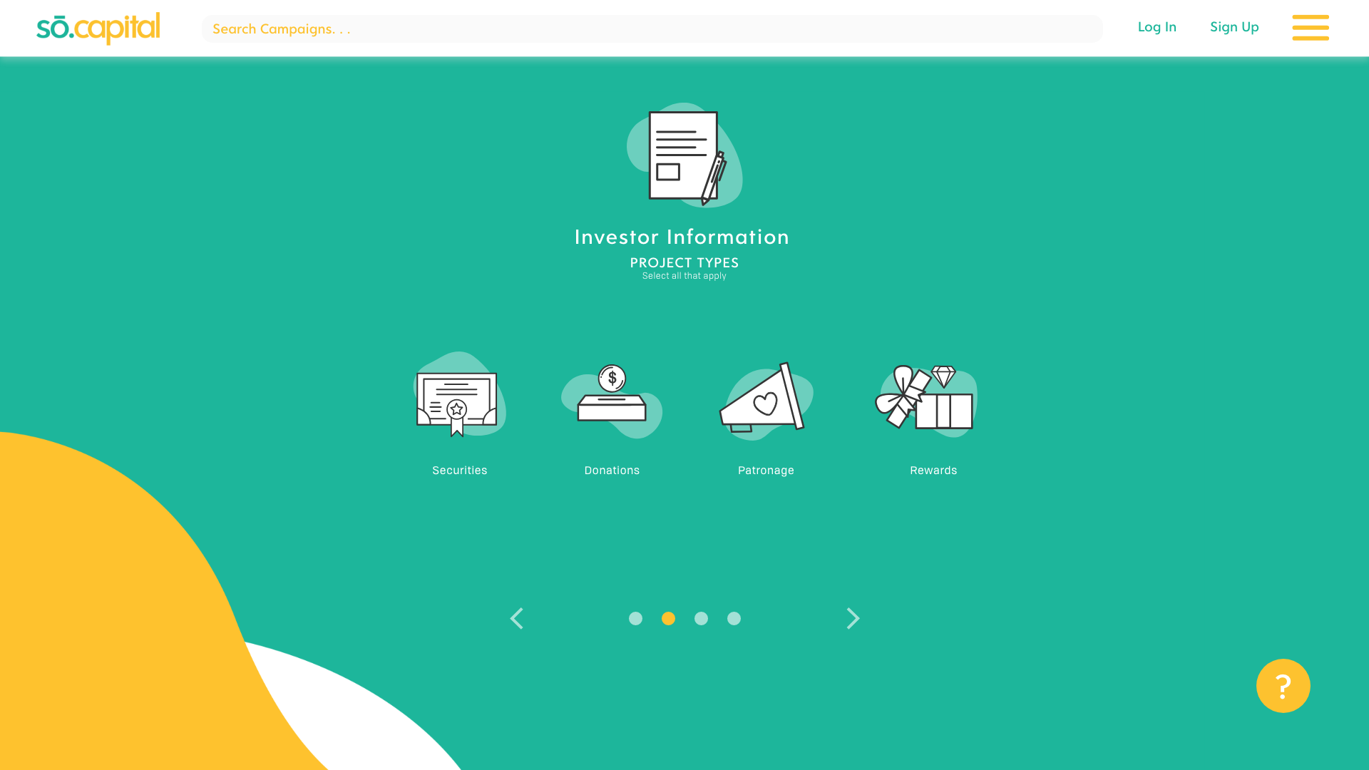
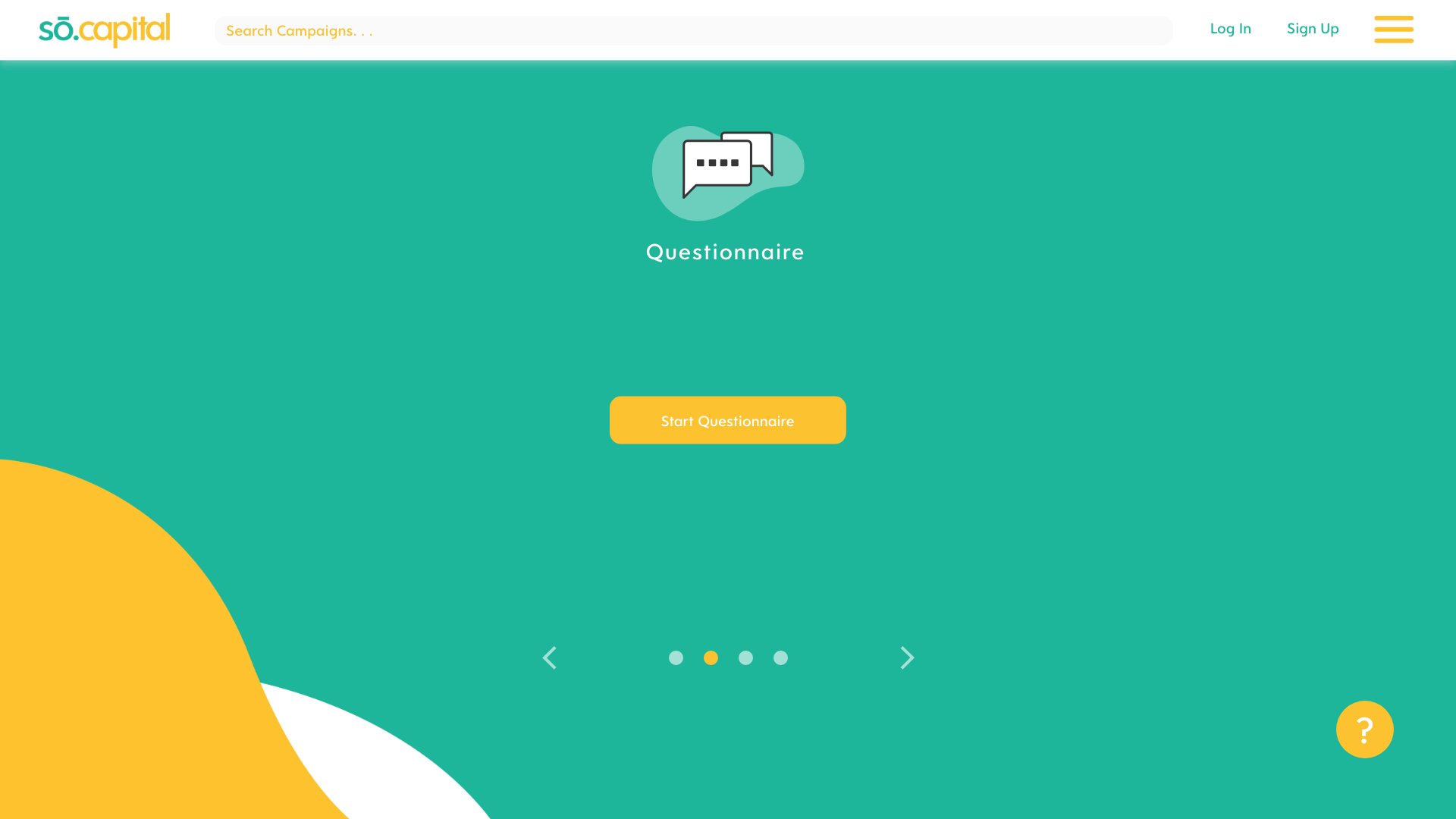
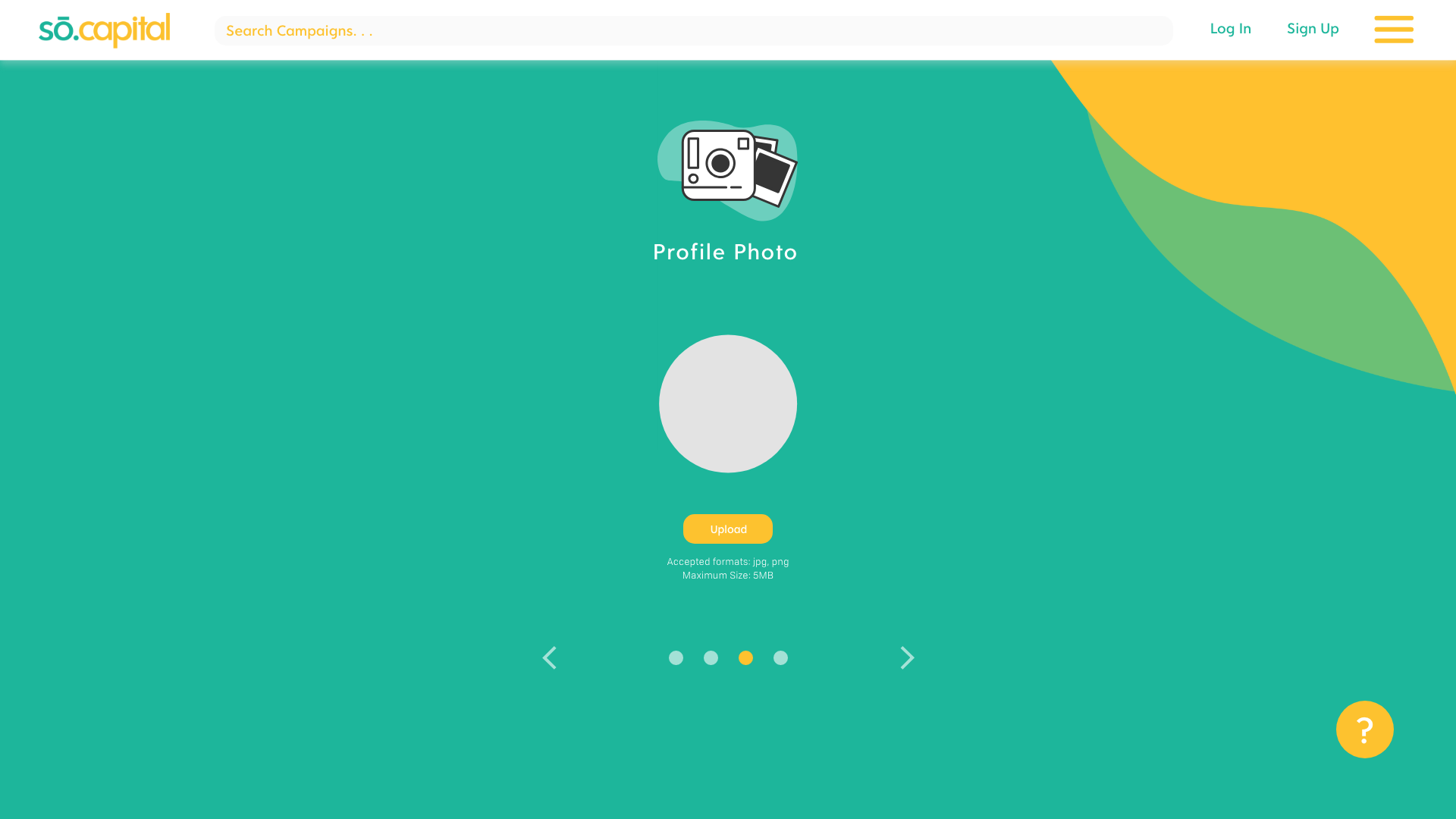
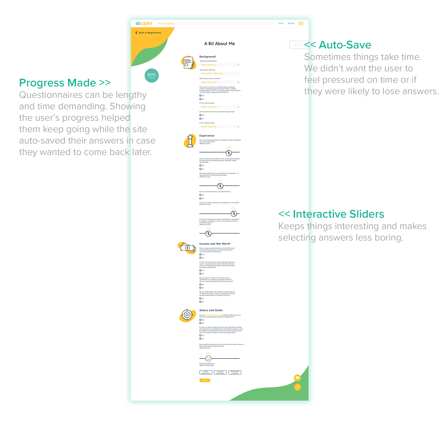
Registration + Questionnaire
Users were encouraged to take a quiz during registration. Their responses help accurately aggregate campaigns that meet their interests and values. Taking the questionnaire also provide users a more personal selection on the campaign homepage and further reduces the hassle of scrolling through too many campaigns. Users are able to skip questions and complete them later in their profile.
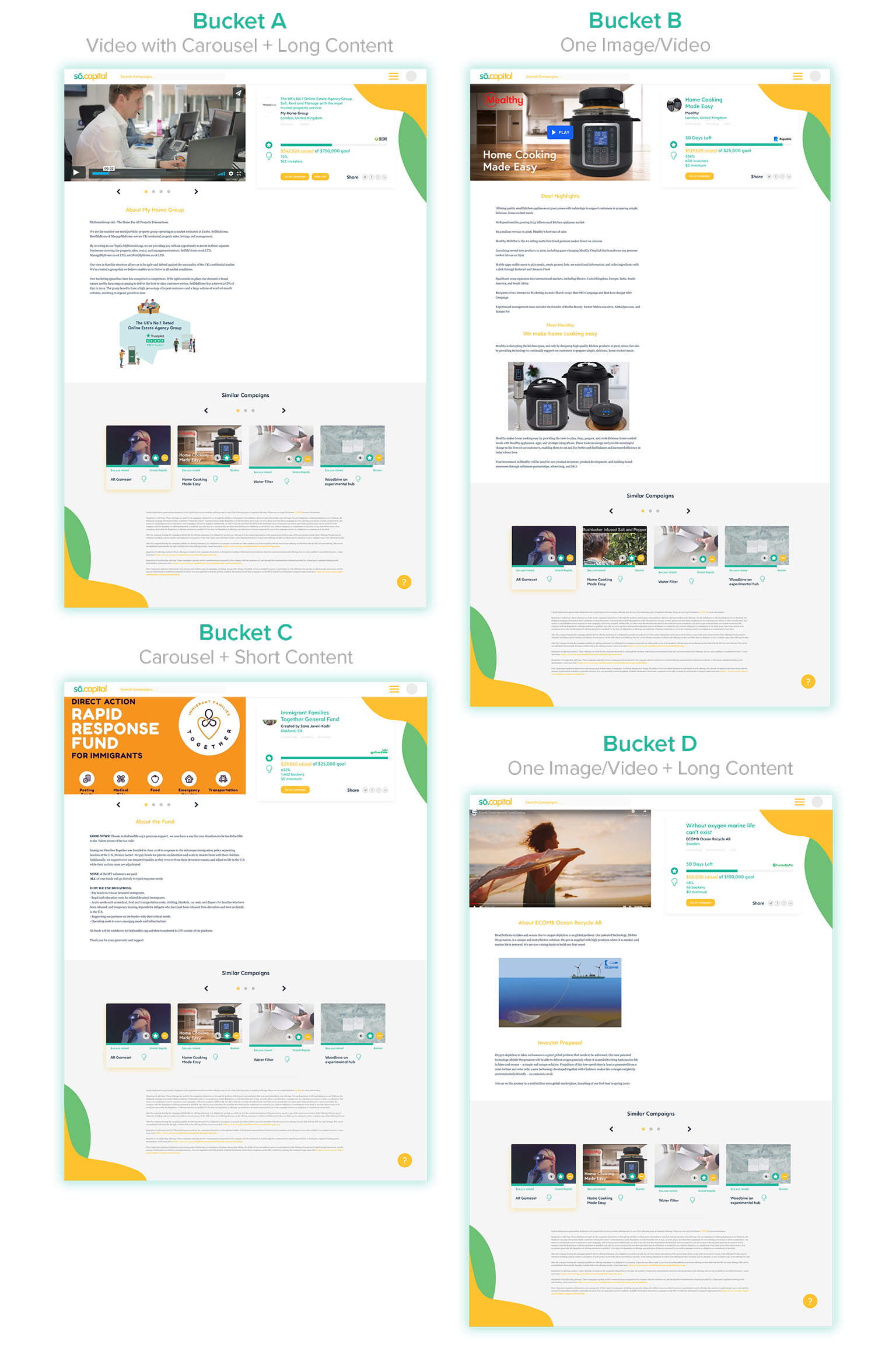
Campaign Overview Page
After clicking campaign pins on homepage, the user is able to view brief details on the campaign
before viewing it on the coordinating third-party site. Four different buckets were created to
accommodate different campaign pages.
before viewing it on the coordinating third-party site. Four different buckets were created to
accommodate different campaign pages.
Challenge!
Creating a card and webpage template for campaigns that had different amounts of text,
different size images, videos, etc. We were not able to use just one design template as some platforms used animations and videos, some used carousels, and others just used text.
We could not just use one template as many campaigns started to look unorganized on the site. Whatever we did had to be simple.
-